Enrollment Journey
Most users were abandoning mid-flow and calling a human to finish. We fixed that. Enrollments grew 171% in a year.
Most enrollments finished by phone.
The enrollment journey for relatives of Banco do Brasil associates was long, fragmented, and not intuitive. Users had to create a pre-registration and go through several document submission steps with call center validation — creating strong dependence on human support, rework, and high abandonment rates.
Research first. Then redesign everything.
I led discovery activities including journey mapping and interviews with users and internal teams. I defined final flows and reviewed business rules with IT, the call center, and business areas. I built the future journey as a high-fidelity prototype in Figma using variables to test multiple scenarios, and followed the full UX to UI cycle through handoff.
Three decisions that reduced call center load.
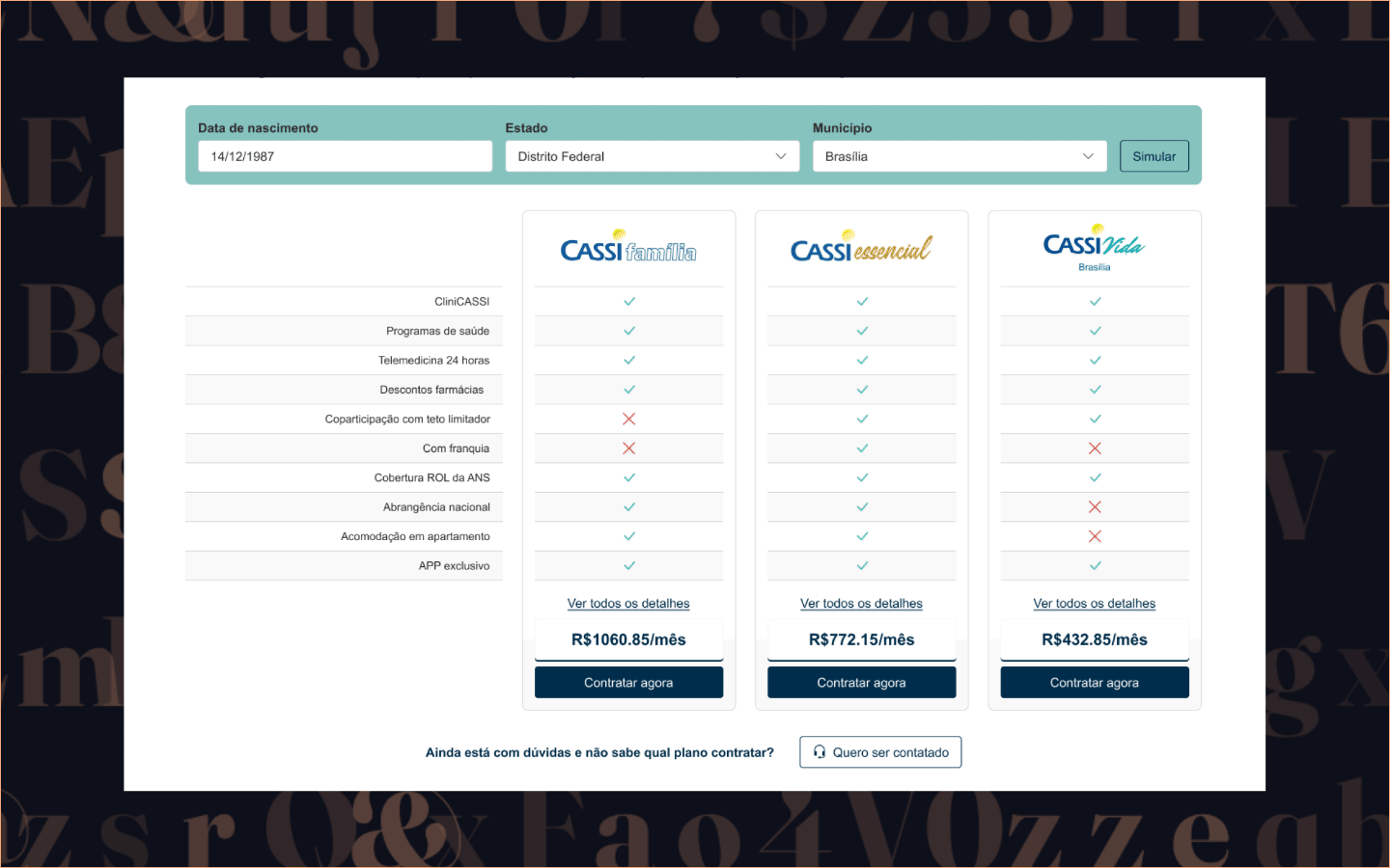
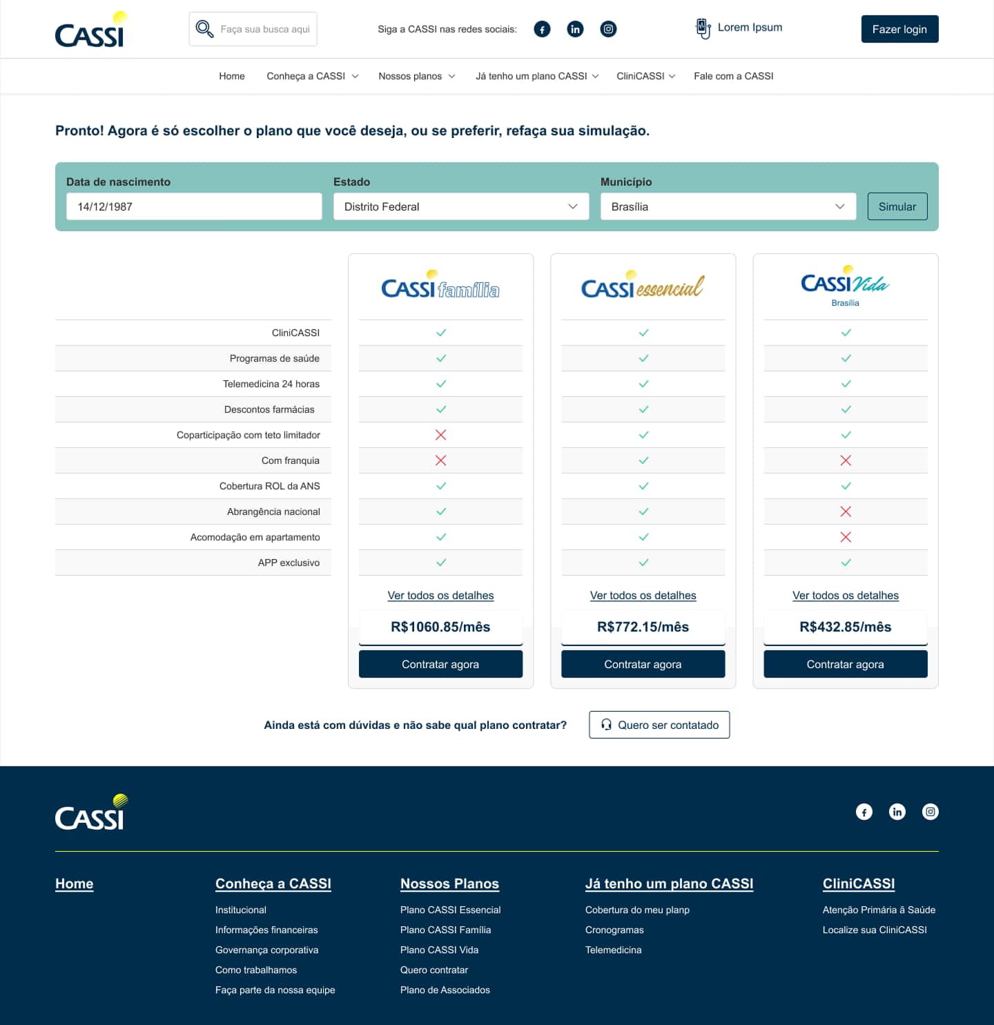
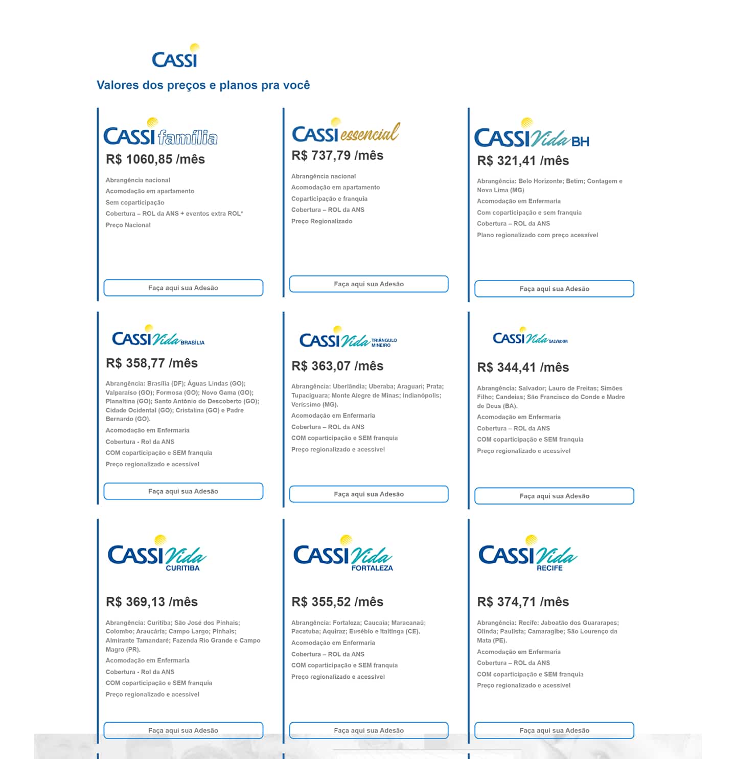
Remove mandatory pre-registration
Users had to create an account before they could understand what plans were available or what documents they'd need. We inverted the flow — let them explore first, commit later. The entry barrier dropped immediately.
Reorganize steps around the user's mental model
The original flow followed an internal logic — what the system needed. We rebuilt it around what users expected: understand options → simulate → choose → fill data → submit documents → track status. Linear and predictable.
Structured status visibility throughout
The absence of visibility into proposal status caused users to call the call center just to know where they stood. We implemented structured status messages and notification points at every stage — the question "what happens next?" was never left unanswered.
From abandoned mid-flow to 171% more completions.
171% growth in one year. Call center load reduced.
171%
more enrollments year over year
408 → 1,105
proposals Jan 2023 vs Jan 2024
↓
call center dependency for common scenarios
Mar 2023
redesigned version launched
Have a project in mind?